Categorical Data Plots
import seaborn as sns
%matplotlib inline
tips = sns.load_dataset('tips')
tips.head()
| total_bill | tip | sex | smoker | day | time | size | |
|---|---|---|---|---|---|---|---|
| 0 | 16.99 | 1.01 | Female | No | Sun | Dinner | 2 |
| 1 | 10.34 | 1.66 | Male | No | Sun | Dinner | 3 |
| 2 | 21.01 | 3.50 | Male | No | Sun | Dinner | 3 |
| 3 | 23.68 | 3.31 | Male | No | Sun | Dinner | 2 |
| 4 | 24.59 | 3.61 | Female | No | Sun | Dinner | 4 |
Barplot and Countplot
These very similar plots allow you to get aggregate data off a categorical feature in your data. barplot is a general plot that allows you to aggregate the categorical data based off some function, by default the mean.
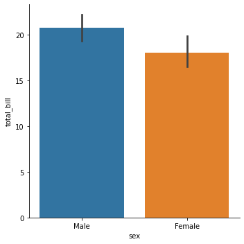
Barplot
sns.barplot(x='sex',y='total_bill',data=tips)
<matplotlib.axes._subplots.AxesSubplot at 0x7f85057e5990>
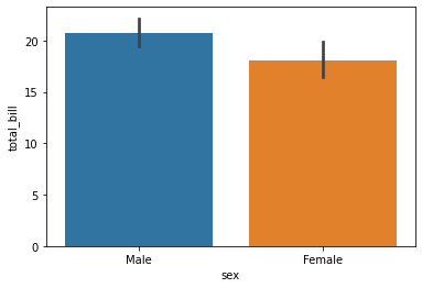
Note
You can change the estimator object to your own function, that converts a vector to a scalar:
# import numpy
import numpy as np
sns.barplot(x='sex',y='total_bill',data=tips,estimator=np.std)
<matplotlib.axes._subplots.AxesSubplot at 0x7f84ef0b64d0>
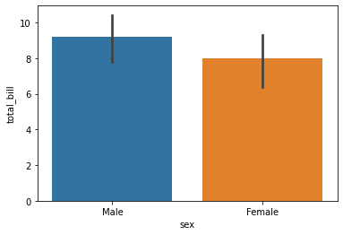
Countplot
This is essentially the same as barplot except the estimator is explicitly counting the number of occurrences. Which is why we only pass the x value
sns.countplot(x='sex',data=tips)
<matplotlib.axes._subplots.AxesSubplot at 0x7f84eca7a350>
Boxplot and Violinplot
boxplots and violinplots are used to shown the distribution of categorical data. A box plot (or box-and-whisker plot) shows the distribution of quantitative data in a way that facilitates comparisons between variables or across levels of a categorical variable. The box shows the quartiles of the dataset while the whiskers extend to show the rest of the distribution, except for points that are determined to be “outliers” using a method that is a function of the inter-quartile range.
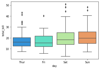
Boxplot
sns.boxplot(x="day", y="total_bill", data=tips,palette='rainbow')
<matplotlib.axes._subplots.AxesSubplot at 0x7f84ec9e4a50>
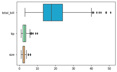
# Can do entire dataframe with orient='h'
sns.boxplot(data=tips,palette='rainbow',orient='h')
<matplotlib.axes._subplots.AxesSubplot at 0x7f84ec986a10>
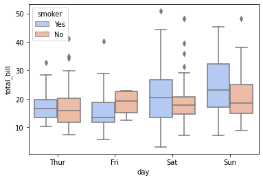
sns.boxplot(x="day", y="total_bill", hue="smoker",data=tips, palette="coolwarm")
<matplotlib.axes._subplots.AxesSubplot at 0x7f84ec912c90>
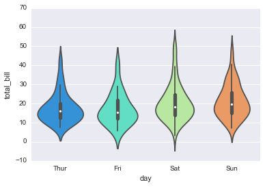
Violinplot
A violin plot plays a similar role as a box and whisker plot. It shows the distribution of quantitative data across several levels of one (or more) categorical variables such that those distributions can be compared. Unlike a box plot, in which all of the plot components correspond to actual datapoints, the violin plot features a kernel density estimation of the underlying distribution.
sns.violinplot(x="day", y="total_bill", data=tips,palette='rainbow')
<matplotlib.axes._subplots.AxesSubplot at 0x11e682ba8>
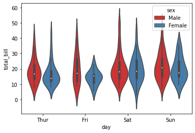
sns.violinplot(x="day", y="total_bill", data=tips,hue='sex',palette='Set1')
<matplotlib.axes._subplots.AxesSubplot at 0x7f84ec7d5850>
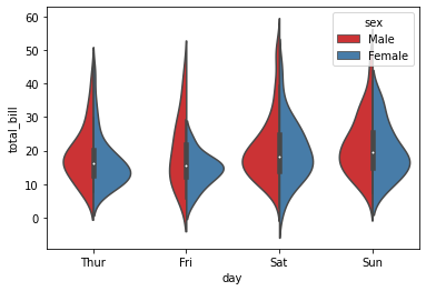
sns.violinplot(x="day", y="total_bill", data=tips,hue='sex',split=True,palette='Set1')
<matplotlib.axes._subplots.AxesSubplot at 0x7f84ec9e9710>
Stripplot and Swarmplot
The stripplot will draw a scatterplot where one variable is categorical. A strip plot can be drawn on its own, but it is also a good complement to a box or violin plot in cases where you want to show all observations along with some representation of the underlying distribution.
The swarmplot is similar to stripplot(), but the points are adjusted (only along the categorical axis) so that they don’t overlap. This gives a better representation of the distribution of values, although it does not scale as well to large numbers of observations (both in terms of the ability to show all the points and in terms of the computation needed to arrange them).
sns.stripplot(x="day", y="total_bill", data=tips)
<matplotlib.axes._subplots.AxesSubplot at 0x7f84ec5e2dd0>
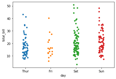
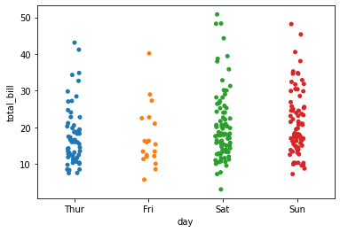
sns.stripplot(x="day", y="total_bill", data=tips,jitter=True)
<matplotlib.axes._subplots.AxesSubplot at 0x7f84ec5c9190>
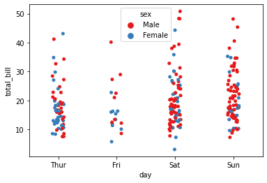
sns.stripplot(x="day", y="total_bill", data=tips,jitter=True,hue='sex',palette='Set1')
<matplotlib.axes._subplots.AxesSubplot at 0x7f84ec532ad0>
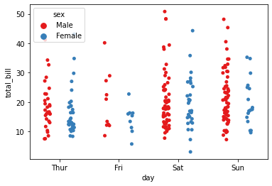
sns.stripplot(x="day", y="total_bill", data=tips,jitter=True,hue='sex',palette='Set1',split=True)
<matplotlib.axes._subplots.AxesSubplot at 0x7f84ea121350>
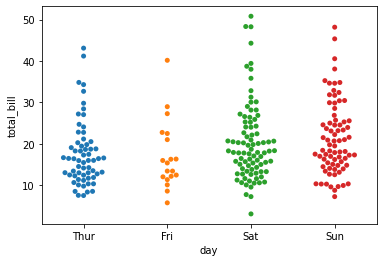
sns.swarmplot(x="day", y="total_bill", data=tips)
<matplotlib.axes._subplots.AxesSubplot at 0x7f84ec3fb9d0>
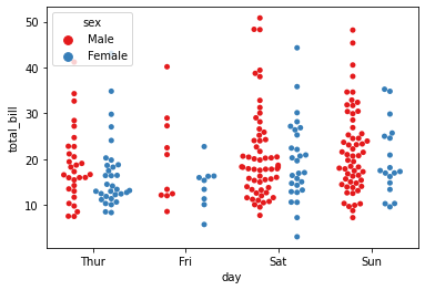
sns.swarmplot(x="day", y="total_bill",hue='sex',data=tips, palette="Set1", split=True)
<matplotlib.axes._subplots.AxesSubplot at 0x7f84ea1a6b10>
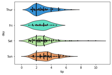
Combining Categorical Plots
sns.violinplot(x="tip", y="day", data=tips,palette='rainbow')
sns.swarmplot(x="tip", y="day", data=tips,color='black',size=3)
<matplotlib.axes._subplots.AxesSubplot at 0x7f84ea2da050>
Factorplot
factorplot is the most general form of a categorical plot. It can take in a kind parameter to adjust the plot type
sns.factorplot(x='sex',y='total_bill',data=tips,kind='bar')
<seaborn.axisgrid.FacetGrid at 0x7f84ec75ab10>